
Mobile Product Page: 5 Things That Matter According to UX Research
You may create your product page on a laptop. However, a large proportion of customers will see it on a screen several times smaller.

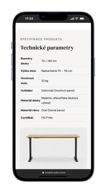
According to the latest research by the Baymard Institute, 62% of the mobile e-commerce sites studied have product pages with average or worse UX.
1. Is the important information really visible?

On mobile, customers can only see a small part of the page at a time. A clear content hierarchy is therefore essential.
They should be able to easily find:
- price and availability,
- product variants,
- key features and specifications,
- shipping and returns,
- the option to add the product to the cart.
A long description is not a problem. The problem is a long block of text in which the customer has to search for a single piece of information.
Help them with headings, bullet points, and clearly separated sections.
2. Can the product really be viewed?
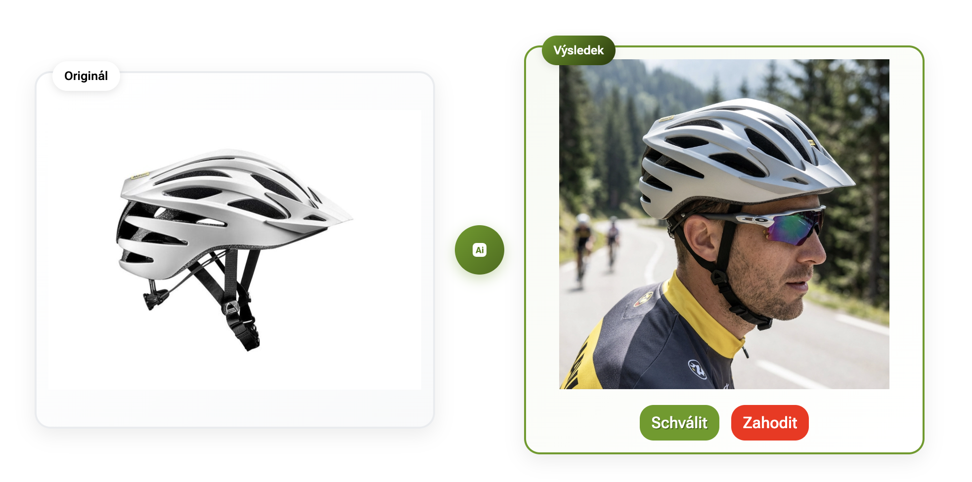
On mobile, it should be immediately clear that the gallery contains additional photos and that the product can be viewed in detail.
Context is also important. According to Baymard, 42% of the users tested tried to estimate the product's actual size from the photos.
So show the product not only on its own, but also in use. A backpack on a person, a lamp in an interior, or a handbag with the items that fit inside it.
3. Do you answer the questions customers have before making a purchase?
Specifications are the foundation, but they are often not enough.
Backpack: Will it fit a 15″ laptop?
Dress: Is the material stretchy?
Sofa: Can you sleep comfortably on it?
These are precisely the kinds of details that can determine whether a customer makes a purchase.
Product content therefore does not need to be as long as possible. Above all, it should answer the questions that are making the customer hesitate.
4. Can customers find shipping and returns information before reaching the cart?
According to Baymard research, 64% of users look for shipping information directly on the product page. Approximately 60% look for return information there.
At the same time, there is no need to copy the entire terms and conditions onto the page.
For example, this is enough:
Delivery from CZK 79 · Ships within 24 hours · Returns within 30 days
along with an option to view the details.
This way, customers do not have to leave the product page to find information they need to make a decision.
5. Do the variants and purchasing work comfortably with a finger?
A size, color, or other variant must be easy to select on a phone.
Check whether:
- it is clear which variant is selected,
- unavailable variants are marked,
- the photos correspond to the selected variant,
- the controls are large enough,
- the Add to cart button is easy to access.
Test your e-shop - it only takes 2 minutes
Open one of your best-selling products on your phone and try to find:
price → availability → variants → key specifications → shipping → returns → additional photos → add to cart
If you have to search for any of this information, your customer probably has to search for it too.
A good mobile product page does not need less content. It needs to organize it better.

Thinking about Pobo? Let us show it to you.
Book a short 30-minute call where we'll show you how Pobo works, what it's good for, and how it can save you a lot of time and money.
Book a call


Book a call