


 Book a call
Description and documentation of vector templates
Vector templates are a design system that can be easily customized to suit individual needs.Vector templates:
why use them and what they are used for
Vector templates are a simple system for styling the labels (widgets) of products, categories and blog articles. With these templates, you can create diverse and varied page designs using CSS variables that define the look of the captions.
In the following article, we will describe simple examples of how to achieve changing the spacing between widgets, changing the size of headings from H2 to H4, paragraphs, bullets and other elements. Next, we will explain the so-called"scope system", which allows you to change the appearance of a particular widget for a specific product, category or article.
Notice
The following tutorial is for more experienced programmers and coders. The user is responsible for any risks associated with these modifications. In order for vector templates to work properly, the original Pobo Designer must be deactivated, and the appearance settings must have your chosen appearance "...".Structure of widgets
To properly understand vector templates, it is necessary to show the widget code. Each contains HTML that is styled using the BEM methodology, which guarantees a stable appearance and predictable behavior. The appearance of the widgets and its content can be set using so-called CSS variables, which are created and edited in the code editor.
Before we start creating the first design, we need to make sure that we have the"Generic label styling system" option selected in the appearance mode settings. Next, in the"Appearance" section, select"Pobo original".
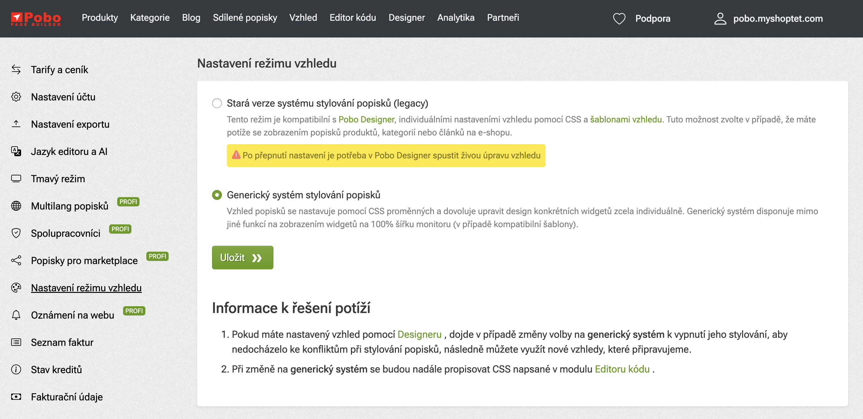 Appearance mode settings
 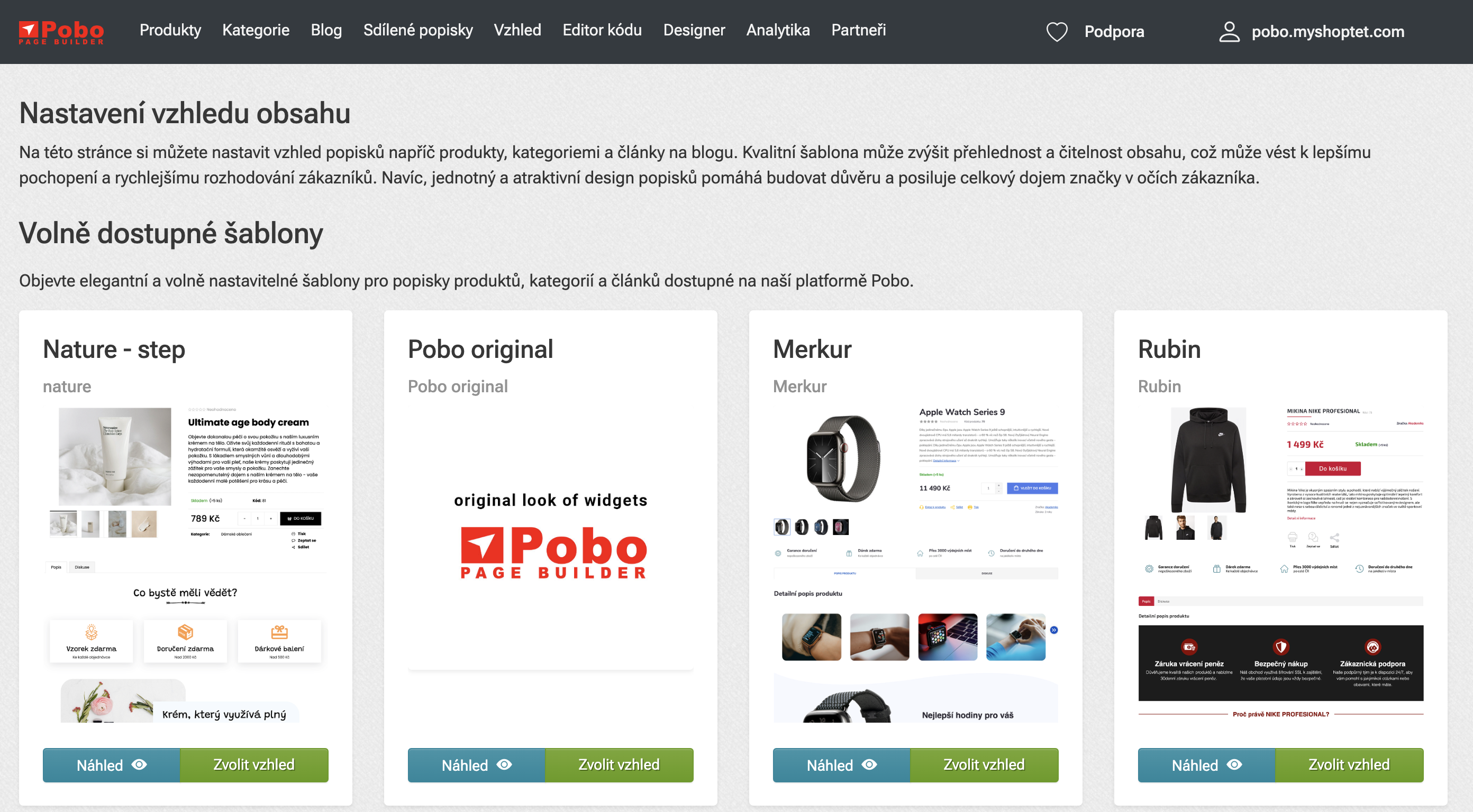 Pobo original settings
 Headings (h2, h3, h4), tables, bullets, links, buttons
Styling typography
Content inserted via the WYSIWYG editor, in which the content can be formatted as H2, H3, H4, paragraph, bullet points, etc., is styled using global variables.
In case we want to change the typography of headings (H2, H3, H4) in wysiwyg editor, we can change properties like size, boldness, color, line height, font type, outer and innerindentation. Last but not least, you can also use (disabled by default) before pseudo elements.
For headings, the following variables are set:
To edit the headings, create a new code called "Edit typography" in the "Appearance" section and insert the following content:
Result
After saving the code, we will see the color changes for the second and third level of headings. This way you can also change the indentation, add a before pseudo element to add an icon or underline with a horizontal line and more.
How to find out which elements can be edited using variables
The fastest way is the so-called code inspection, where you just right-click on a paragraph and select "Code Inspection" or "Explore" from the drop-down menu (depending on the operating system and browser). Then we get a panel with the HTML label on the left and a list of variables on the right.
Variables starting with the --pobo-* prefix can be clicked through to find their default values. They can then be edited.
Maximum width and vertical offset of widgets
All widgets have the following maximum width, margin and padding by default:
These values can be adjusted as needed, e.g. to reduce padding, and thus reduce the space between widgets. It is also important to note that they are applied to all widgets, however there is a way to set specific widget specific properties such as background, indentation, etc.
Scope system - modifying the design of a specific widget
There are situations where you need to affect a specific widget for a specific product, category or blog article. For this purpose, we have created a so-called scope system that allows you to influence the appearance of a specific widget (or its ID). Now we will show how to invert the widget with the icon strip you see on this page. And this is only for one specific widget, so if you use the same widget again, these styles will not be automatically applied to it.
 Black belt
 Each widget contains several key attributes that are important for its proper function and customization. We can use the data-pobo-widget-id attribute to make global modifications to a particular widget that will be visible whenever the widget is used. This attribute carries information about the unique ID for a particular widget and is common to all widgets of the same type.
The data-pobo-unique-id attribute is more important for customizing individual widget instances. This attribute is unique for each widget usage, allowing us to style a particular widget without affecting other instances of that widget.
A practical use in CSS might look like the following:
 Before editing with data-pobo-unique-id
 Using these attributes, we can effectively manage and style the widgets on our site.
If we have CSS code in the following form, we can edit only one specific widget. In our case, we want to modify the widget's background, text color, and size of each icon. The complete code that will help us achieve the desired look of the widget with icons might look like this:
 Edit with data-pobo-unique-id
 Step-by-step demonstration
Now we'll show you how to proceed step by step if you want to customize a widget from our menu using a simple example. In the two images below you can see two widgets displayed, on the left in Pobo Page Builder and on the right the widgets are already exported to the e-shop.
But let's say we are not completely comfortable with this classic look and want to make some minor changes. For example, we would like to change the color, size and font of the 2nd level heading. So how to do it using vector templates?
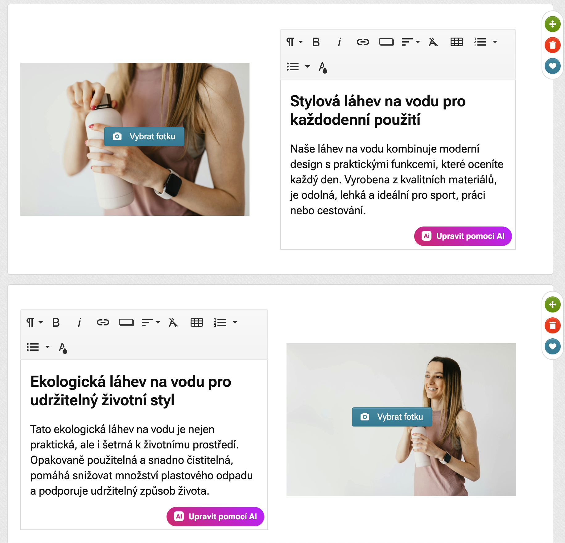 Widgets in Pobo Page Builder
 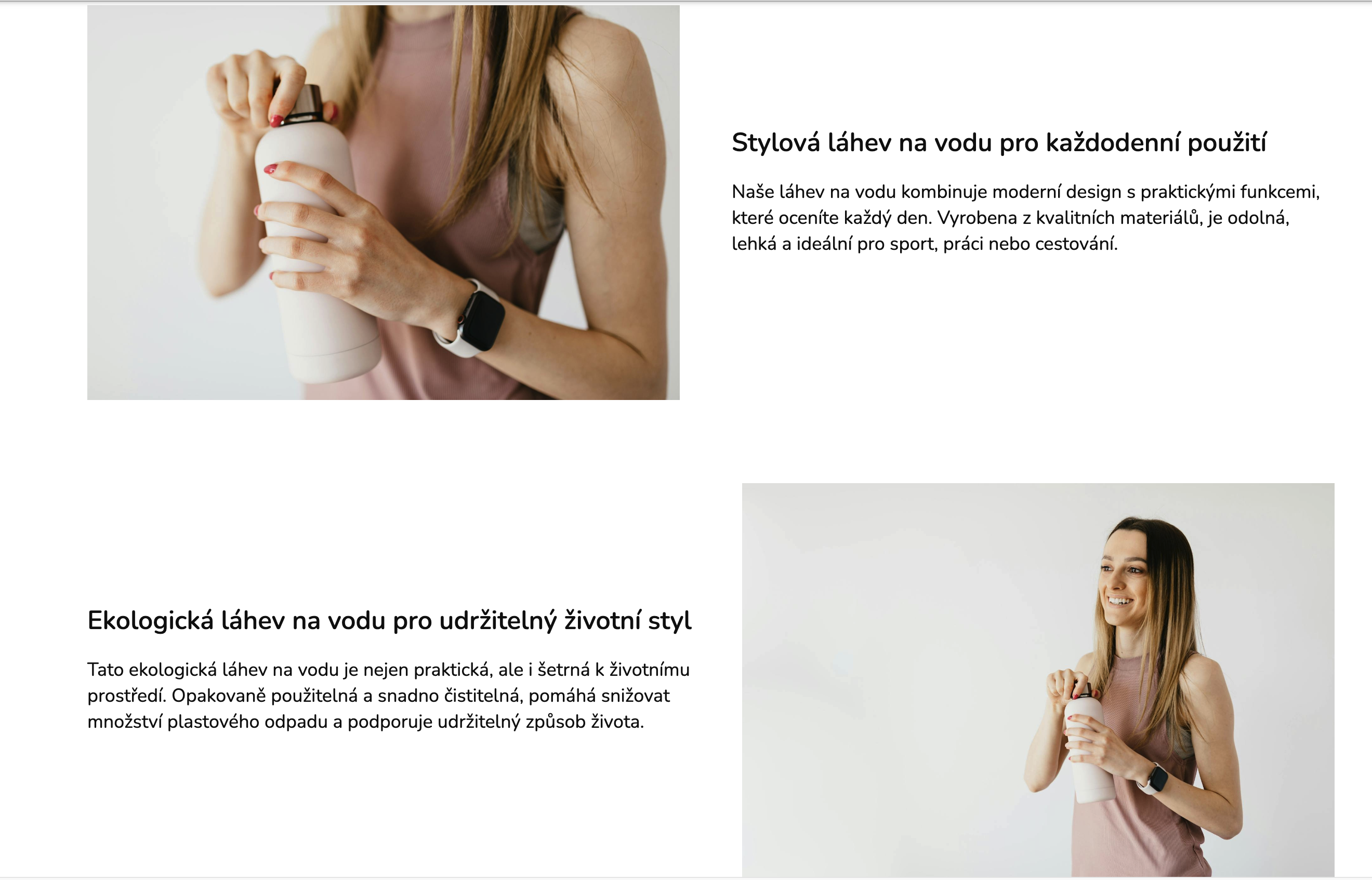 Widgets on the e-shop
 Step 1 - Create a CSS file in Pobo
Go to Appearance -> Custom CSS Code in the top menu and click on the "Create New Style" button. For example, name the style "Edit widgets with image right and left" and insert the following HTML code.
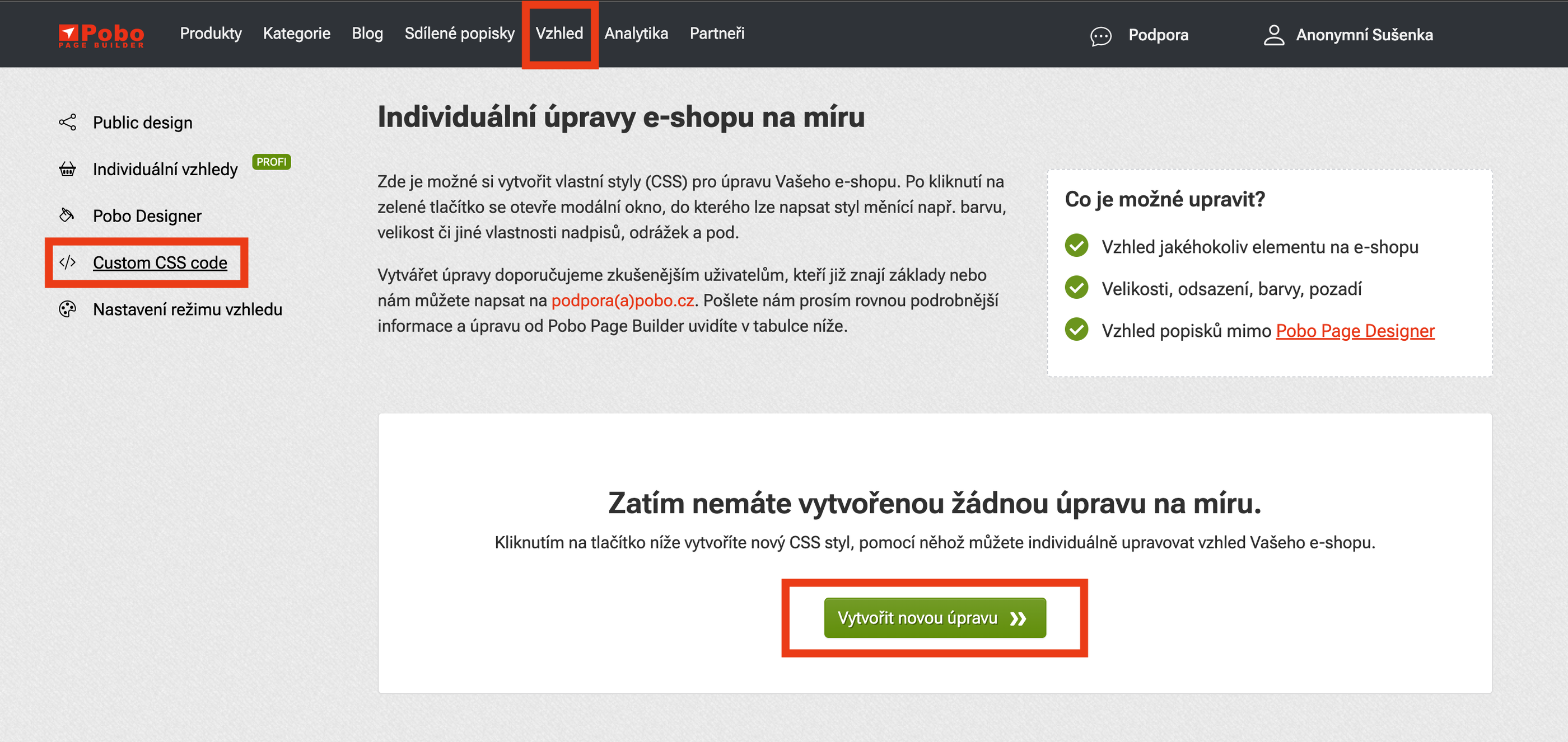 Image description (delete if you don't want to include it)
 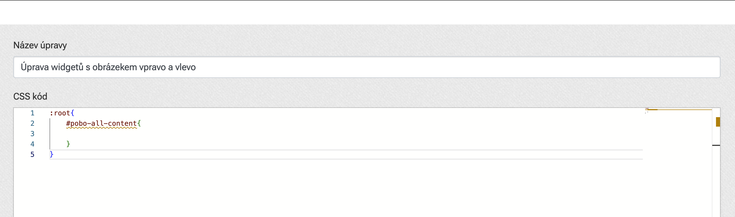 Image description (delete if you don't want to include it)
 Step 2 - Find variables
Once again, let's remind ourselves what modifications we want to make.
- Level 2 heading color
- Level 2 heading size
- Level 2 heading font
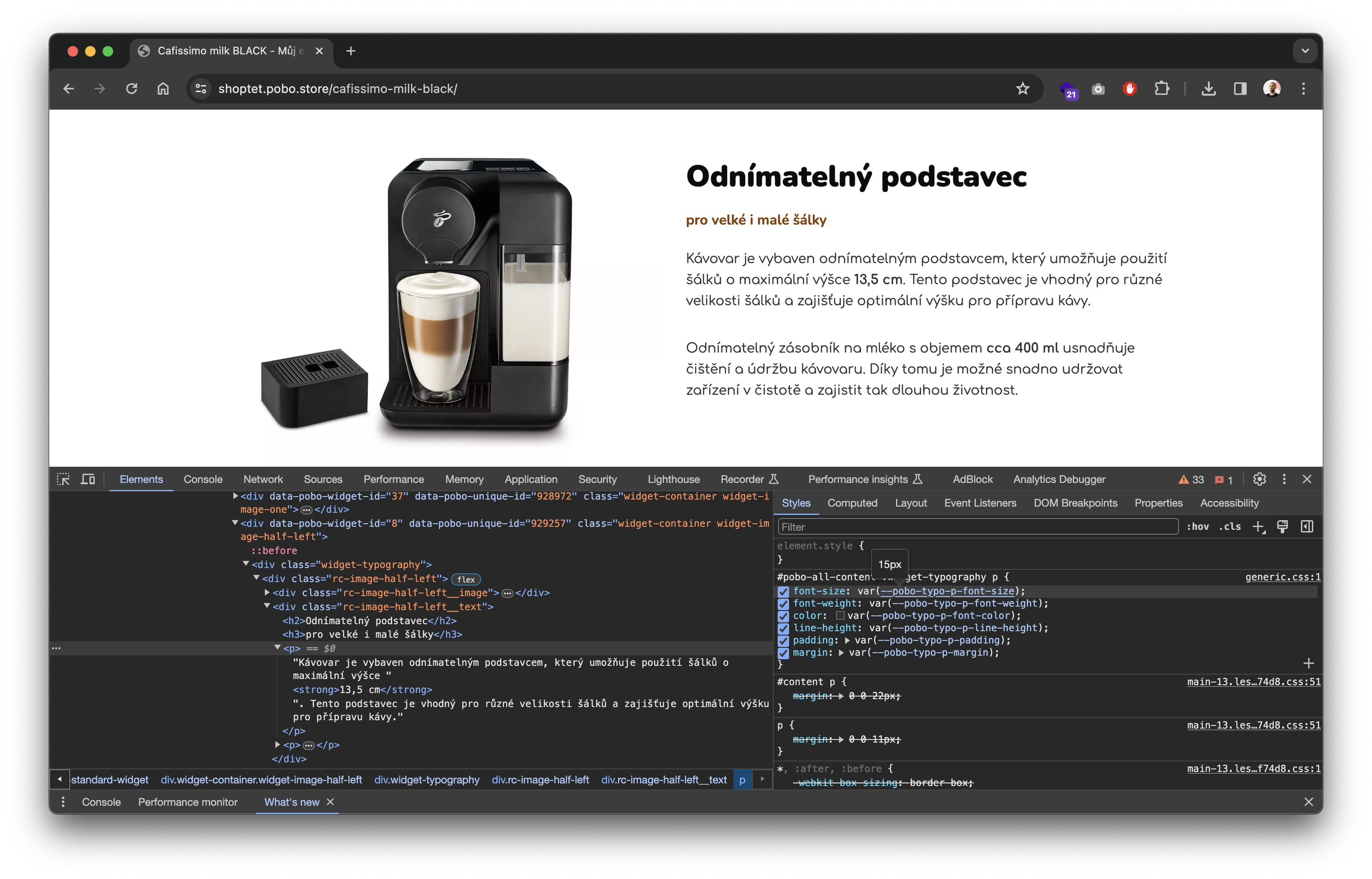
So let's focus on the headline, because that's where we're going to make the edits now. Let's move on to our product on the e-shop. We'll select the headline using our mouse, right click on it and choose "Explore or Check Element". We should now see this section of CSS code in the browser.
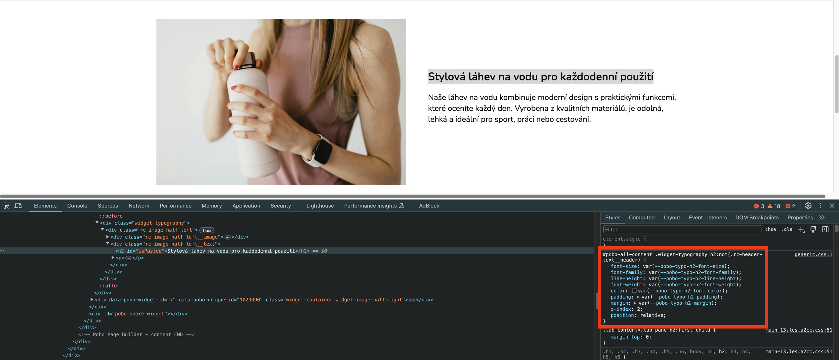
Step 3 - Insert into CSS
We only copy the variables we are interested in. That is, the variables for font-size, color and font-family. We just need the names of these variables (which always start with two hyphens) and paste them into our CSS code that we created earlier.
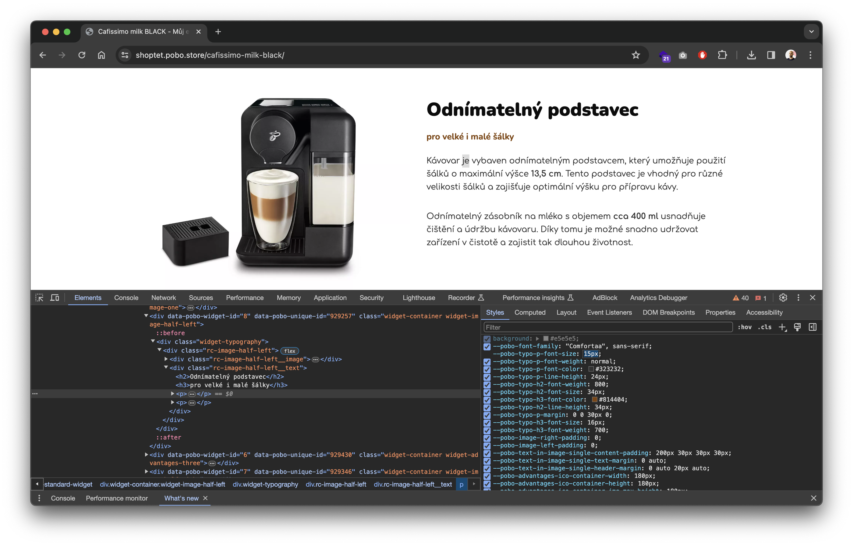
Step 4 - Filling with values
Now we just need to fill the HTML code with the values we need. The size of the text is most often specified in pixels. So you can try for example a value of 30px and then edit it to the best of your ability. For a font, just put its name in quotes, e.g. "Impact", and for a color, its hexadecimal code. For example, for red: #ed0004
In the editor, click on the save button and you can go to the e-shop to see the changes.
Previously 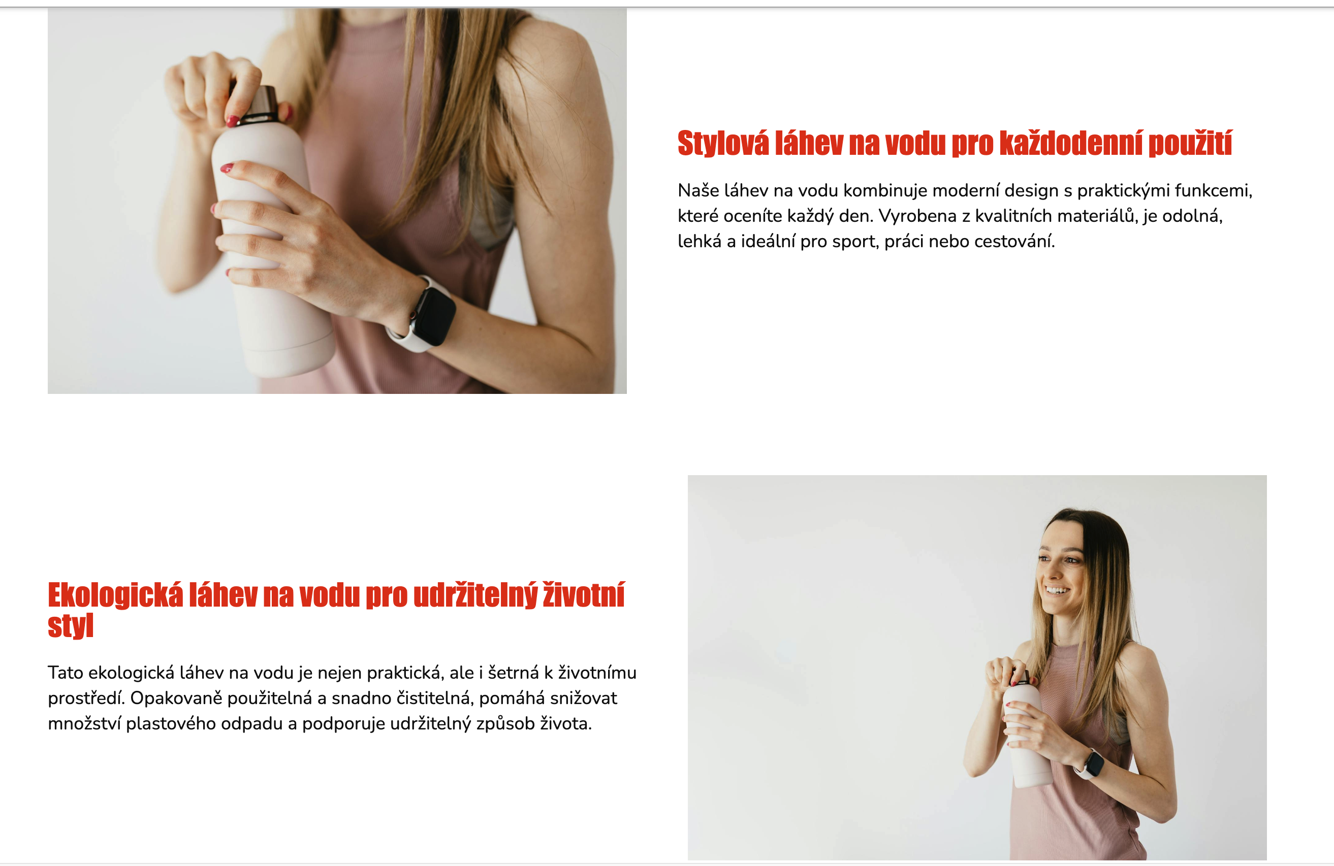 Then
Then